State of ShopBack Design Systems
State of ShopBack Design Systems is my yearly report on the design system's status, health and progress. As the design system lead and owner, I write it each year so stakeholders can see how the system has grown and what it has changed across the organisation.
Introduction
What is the ShopBack Design System (SBDS)?
Our design system consists of three components:
- Design tokens store the base design decisions, such as colour, font size, spacing and corner radius.
- The mobile library is the iOS and Android library for the ShopBack app.
- The web React library is the web library for ShopBack's consumer products and internal tools.
What problems does the design system solve?
The design system aims to solve two main problems:
Speed and efficiency
A library of ready-made components and design assets speeds up design and development. Teams spend less time building designs or code from scratch, and more time improving the user experience.
When a team builds a page from design system components, it should always take much less effort.
Scalability
We design components to scale, so they grow with the organisation and the product. We can update an existing component at any time, with little risk or effort.
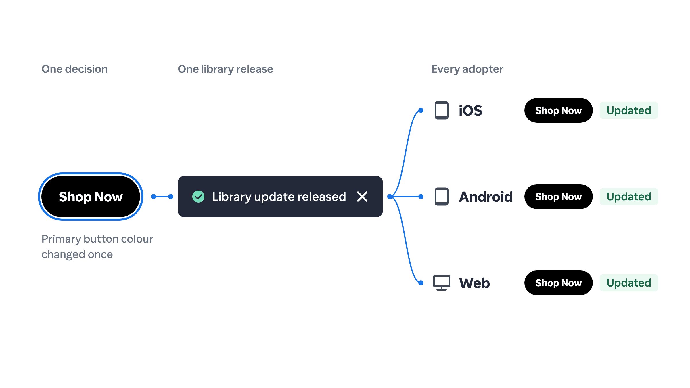
If we change a component, for example the primary button from black to orange, every adopter gets the change automatically in the next UI library update.
What about design consistency?
Consistent visuals across features are one reason to have a design system, but they should not take centre stage.
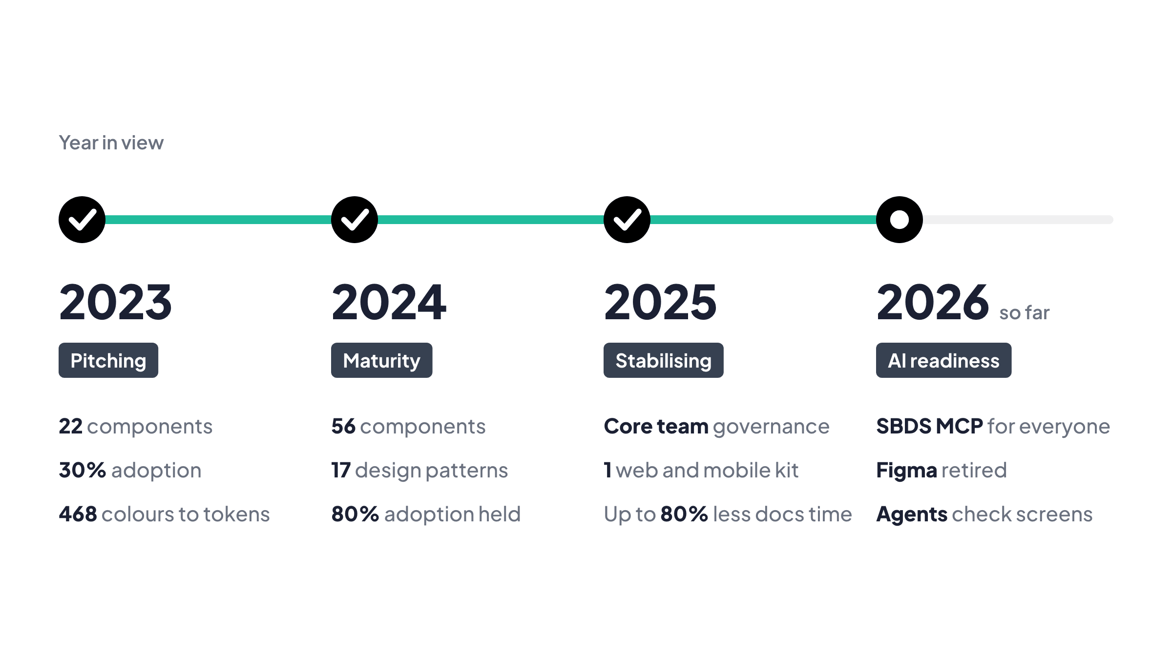
2026 year in view
In progress. I write the year in view every December, and two months of 2026 are still to come. This covers what we have done so far.
A year about letting everyone in the organisation use SBDS.
In 2026 the product org moved to a builder model. Product managers, designers and engineers now build across the whole product with AI. Leadership announced the shift at the end of July 2026.
That changed who needs the design system. Designers used to work from the Figma kit and engineers from Confluence. Figma was the main blocker for everyone else. Its AI integration was limited, and outside the design team few people knew how to use it.
So we retired Figma from the product design workflow and opened SBDS to the whole organisation. Anyone can now build with it or ask it questions through Claude.
So far this year
Anyone can use SBDS through Claude
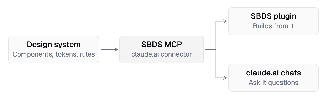
In 2025 we set a goal to make every component ready for the Model Context Protocol (MCP). We built SBDS MCP. It gives Claude the design tokens, components and rules, and it runs as a connector. Anyone in the organisation can ask it questions in a chat, and the Claude plugin builds screens from it.
What does this mean?
No one has to learn Figma to use SBDS. A product manager builds a screen with the same components and tokens a designer would pick.
We retired Figma and moved design to code
Last year we planned to try tools beyond Figma. We went further and retired it.
Every product designer now designs in Claude Code. The first hi-fi design we made without Figma went to engineering kickoff. Handoff runs through an agent-readable template. It lists each screen's states and when they show, with a prompt an engineer's agent builds from.
What does this mean?
Hi-fi design takes one to two days, down from about a week. Designers spend the time they get back on interaction, animation and prototypes.
Agents check the standard, people own the screens
In 2025 we reset governance with a core team and quarterly contributions from every product designer. In 2026 product managers started building screens too, and most new builders are not designers.
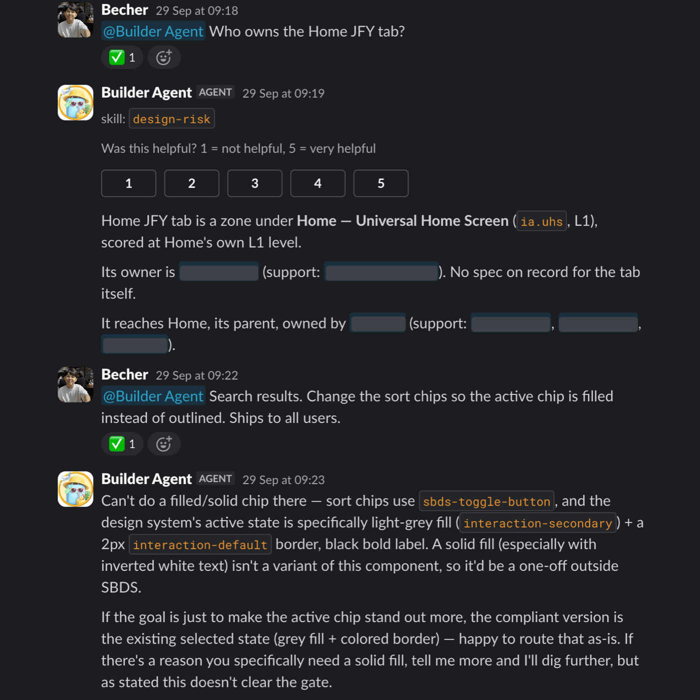
We gave the first check to agents. The Claude plugin checks a screen against the design standard. The Builder Agent names the screen's owner and stops a change that would break SBDS.
The tools were the easy part. The real blockers were who owns what and when work counts as done.
What does this mean?
Non-designers can build on SBDS without a designer checking every screen, because agents catch changes that would break it.
Guidelines as a graph
Last year AI tools such as SpecDoc and AskDS cut documentation time by up to 80%. This year agents started reading the guidelines too, and an agent works best with only the rules for its screen.
We stored design rules, components and standards as one connected graph. Each link says which rule applies to which component. An agent pulls only the rules that matter for the screen in front of it.
What does this mean?
Designers and agents follow the same rules, and a rule changes in one place.
Current state of SBDS
- Open to the whole organisation. SBDS MCP gives Claude the tokens, components and rules. Anyone can ask it questions, and the Claude plugin builds screens from it.
- No Figma. Every product designer designs in Claude Code, and handoff runs through an agent-readable template.
- More builders. Product managers start a project and show the idea without waiting for a designer. The plugin keeps that early work on standard.
What are we doing in the rest of 2026?
The last two months are about benchmarks and measurement. Now that anyone can build with SBDS, we need to know whether that work follows the standard.
Focus areas:
- Build a benchmark that tests how closely agent-built screens follow SBDS.
- Measure who uses SBDS across the organisation, and how often.
2025 year in view
A year of stabilising the system, adapting to product changes and preparing it to last.
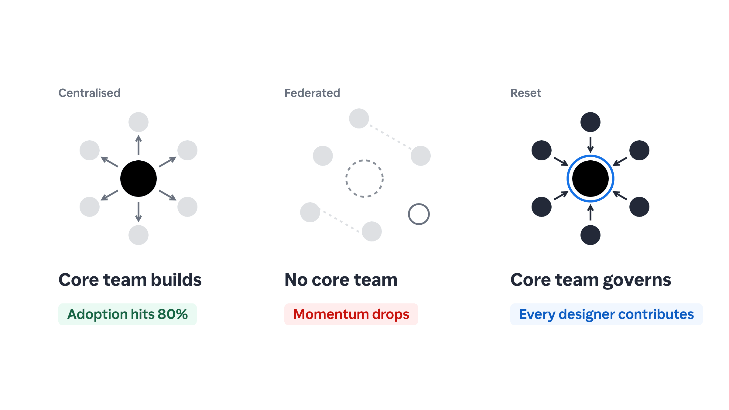
2025 was a year of resets for the design system team. After widespread adoption in earlier years, consistency slipped because of decentralised governance and organisational changes.
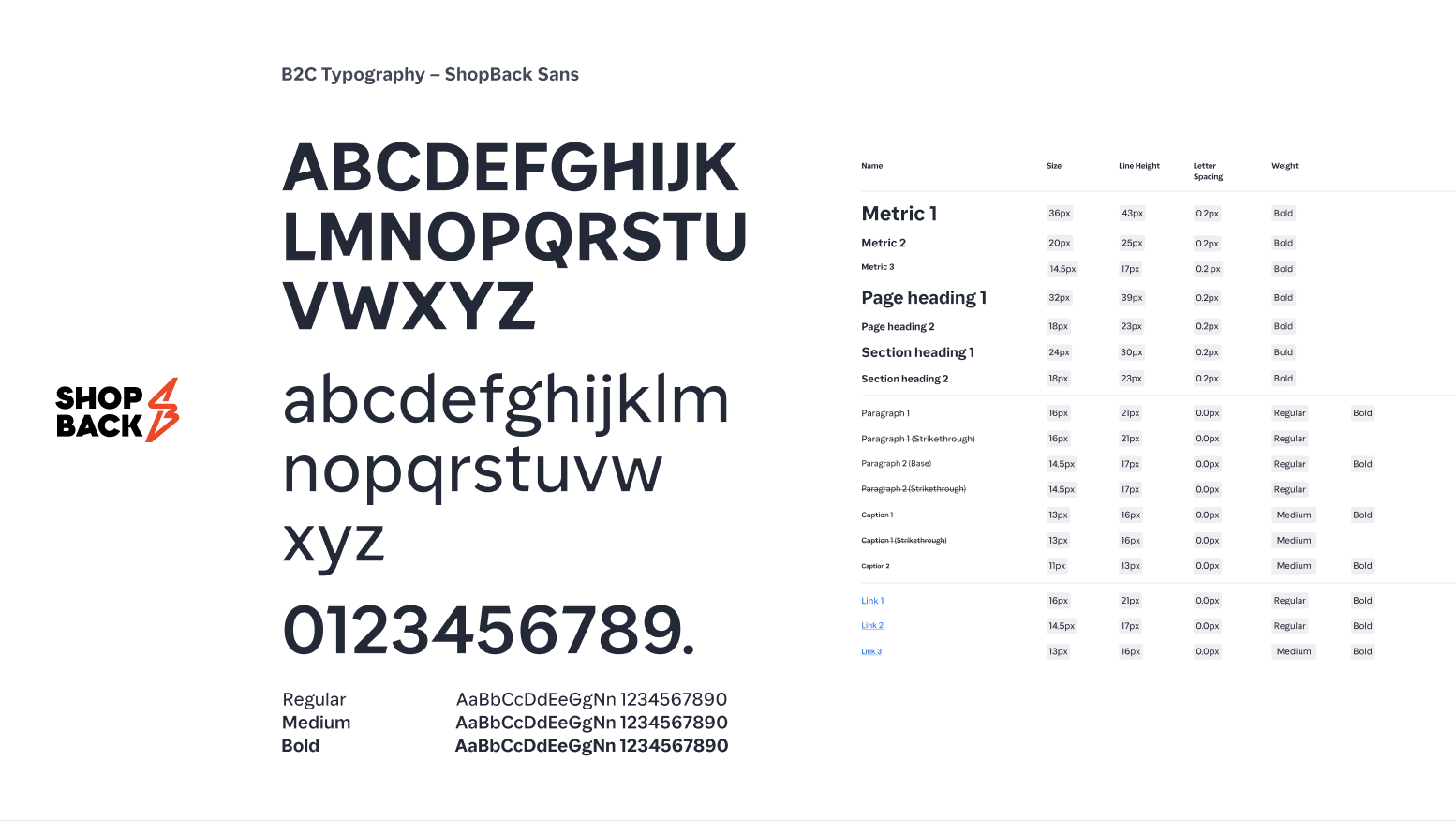
We used it to strengthen the design system's foundations. We re-established governance and aligned it with company-wide changes, such as WebView and our own font, ShopBack Sans. We also explored how AI can help the system scale.
2025 in review
Governance reset after peak adoption
When governance spread across teams, implementation became inconsistent and no one clearly owned components. As key contributors moved on, new members lacked guidance, and components fragmented and duplicated.
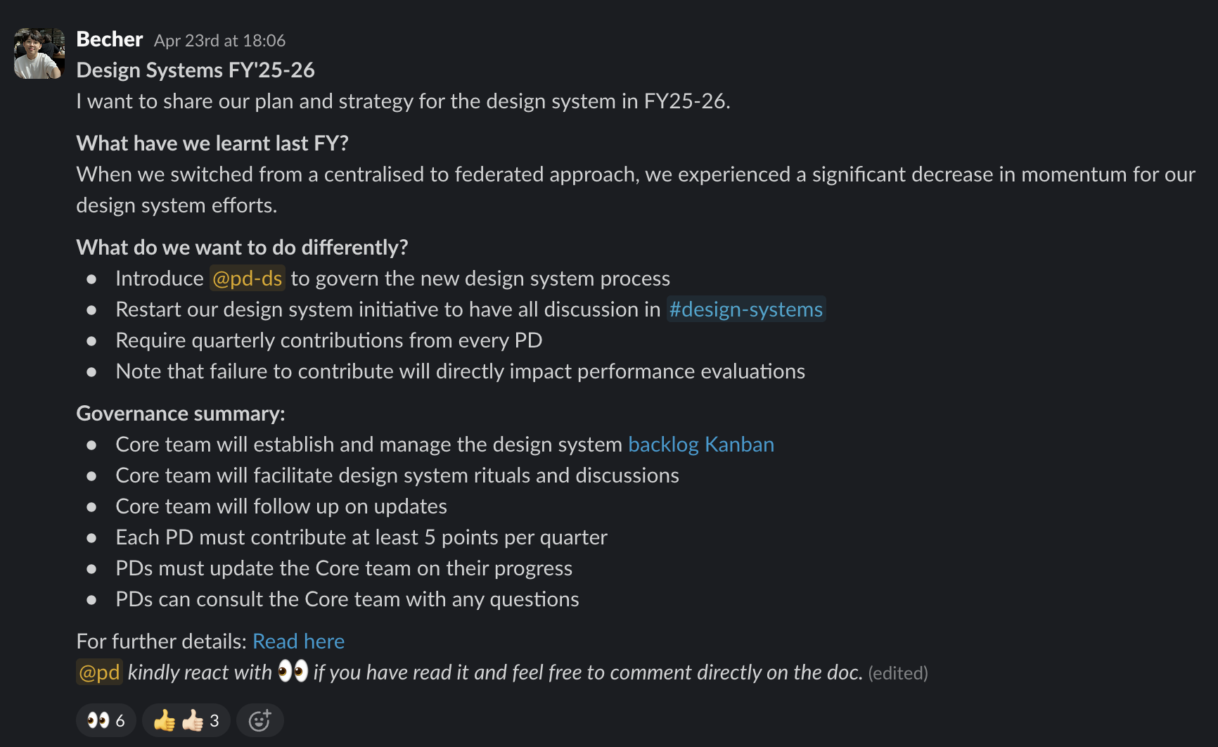
We brought back a dedicated core design system team for governance, tooling and team education. We restarted design system office hours and design audits, and audited the library to merge duplicate and one-off components.
What does this mean?
With stronger oversight, any team can contribute without the system losing cohesion. All discussion now runs through the #design-systems channel.
Aligning with rapid product growth and experimentation
WebView made product experiments faster but added complexity. Teams mixed native and web elements on the same screens, which made visuals and behaviour inconsistent. After two years with little focus on web, the web library barely existed.
We merged the web and mobile libraries into one Figma kit and wrote guidance on when to use native or WebView components. We also rolled out the new ShopBack font across all design tokens, so every ShopBack product shares one visual identity.
What does this mean?
Teams now work from one system for web and native, so they can experiment faster.
AI for design system operations
Keeping documentation current and onboarding new team members still took a lot of effort. Teams often struggled to understand or implement design system components.
We used a custom GPT to write and update component documentation automatically. We also launched AskDS, an AI assistant that answers common design system questions, so stakeholders can help themselves.
| Tool | Purpose and features | Common use cases |
|---|---|---|
| SpecDoc: Design System Documentation | • Helps designers and engineers write, update and review component documentation with the SBDS template. • Shows drafts and edits live on a shared canvas, so everyone works from the same structure. • Pulls content from the SBDS Confluence space and drafts component documentation from Figma links or screenshots. | • Writing new component documentation from scratch • Reviewing existing docs for structure, tone and completeness • Converting component screenshots or Figma links into draft documentation • Updating sections of a component's doc in the canvas |
| AskDS: Design System Support Assistant | • Answers questions about components, patterns, usage guidelines and onboarding from the official Confluence documentation. • Accepts screenshots, so designers can check a mock-up against the design system standards. • Answers only from Confluence documentation, through Confluence plugins. | • Searching for the correct component to use in a specific layout or interaction • Validating whether a design aligns with existing component guidelines • Locating Figma tokens or understanding how to apply them correctly • Getting onboarding help when joining the design or product team |
| SBDS Component Variant Structuring Assistant | • Standardises Figma component variants for ShopBack Design System (SBDS) with clean, scalable property structures • Works for refactoring and for new components, so product designers can match visual states to code-ready props • Generates implementation-ready Figma setup including dropdowns, booleans, text overrides and slot recommendations | • Refactor existing components with messy or inconsistent variant property setups • Define property structure for new components based on visual design variants • Map Figma variants to MCP and front-end props, so handoff between design and engineering is clearer |
What does this mean?
AI cut manual work and made design guidance easier for every team to find.
Current state of SBDS
- Mobile adoption and engineering support. Native mobile components stay healthy, with governance and support from their engineering teams. The most used components already run on Swift and Jetpack Compose, so they will keep scaling.
- One cross-platform library. Web and native libraries now share one Figma file and one set of tokens for type, spacing and layout. Teams can use platform-agnostic components on mobile and web, which cuts duplication.
- Faster documentation with AI. AI tools cut the time to write documentation by up to 80%, which frees up design and engineering time.
- Team engagement and contribution. A clearer backlog, more structured async discussions and better onboarding help teams contribute to SBDS with confidence.
What we are doing in the rest of FY25'26
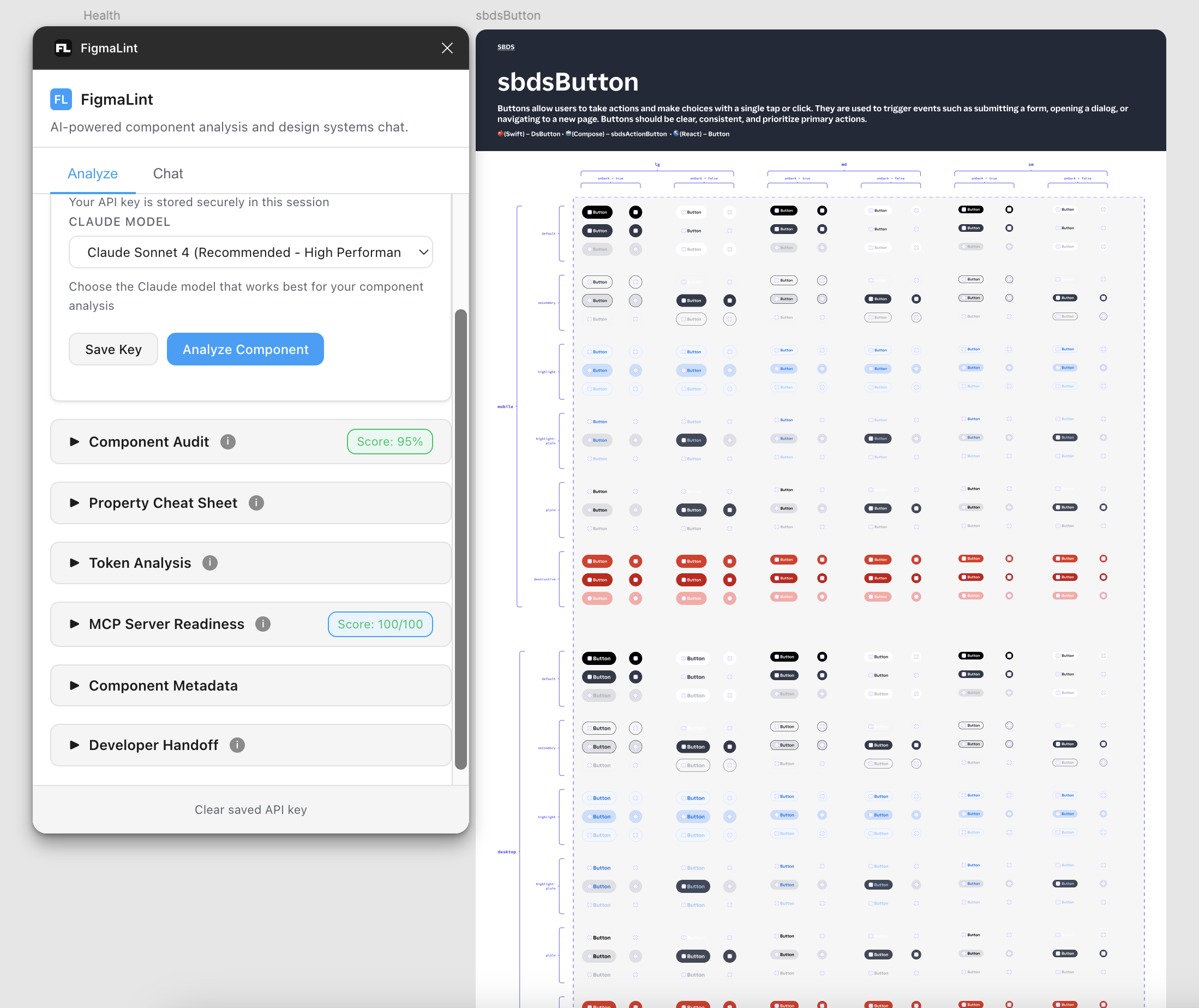
We want the design system to scale and stay clear across every product. We aim to make every component MCP-ready for the company's modular commerce platform. Stronger cross-platform architecture and more consistent tokens should cut technical debt and make implementation easier. We will also try tools beyond Figma that work in code and speed up delivery. Finally, we will rebuild our internal design system so operations teams move faster with fewer dependencies.
Focus areas:
- Make every component meet the MCP guidelines and modular specs.
- Redesign and launch the internal design system library for internal tools.
- Pilot new tools such as Lovable, Bolt or Builder.io (opens in a new tab), and test whether they fit our stack.
- Keep refining how teams contribute to and govern the design system.
- Keep using AI to automate documentation and support design decisions at scale.
2024 year in view
A year of adoption and maturity.
This year the ShopBack Design System reached a milestone. We no longer chase feature teams to adopt it, and we can focus on making it mature. Thank you to every feature team that helped.
What we committed to in 2023:
- Stronger adoption starting with new pages
- Enhancement of existing components
- Better documentation
- A feedback loop for component improvements
2023 in review
Stronger adoption starting with new pages
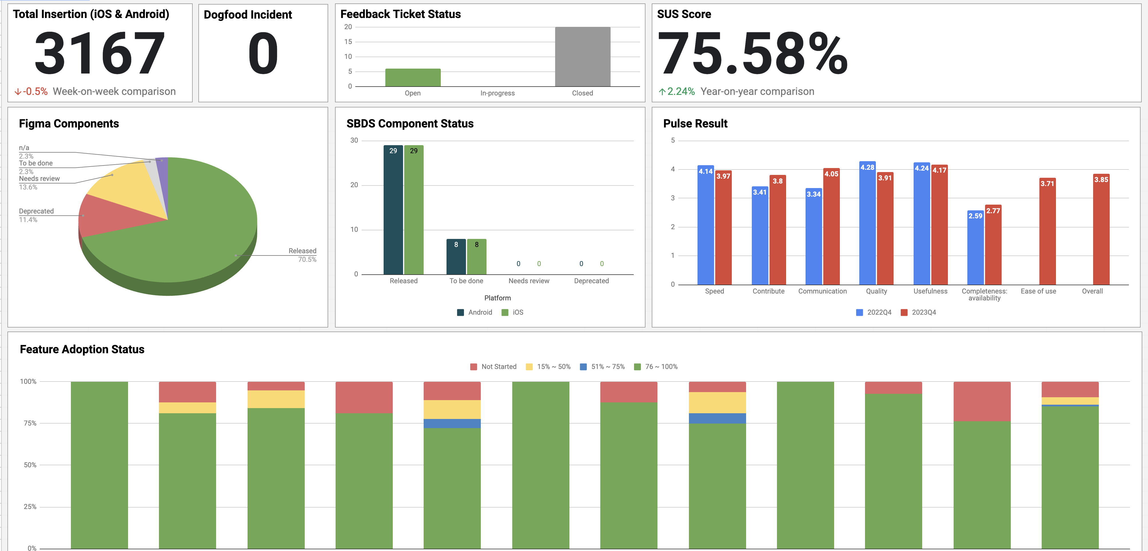
Feature teams with limited resources found it hard to adopt the design system widely. In Q3 2023 we made 80% adoption a team-level objective (TLO), so it was no longer a side project. Thank you to every feature team that supported it.
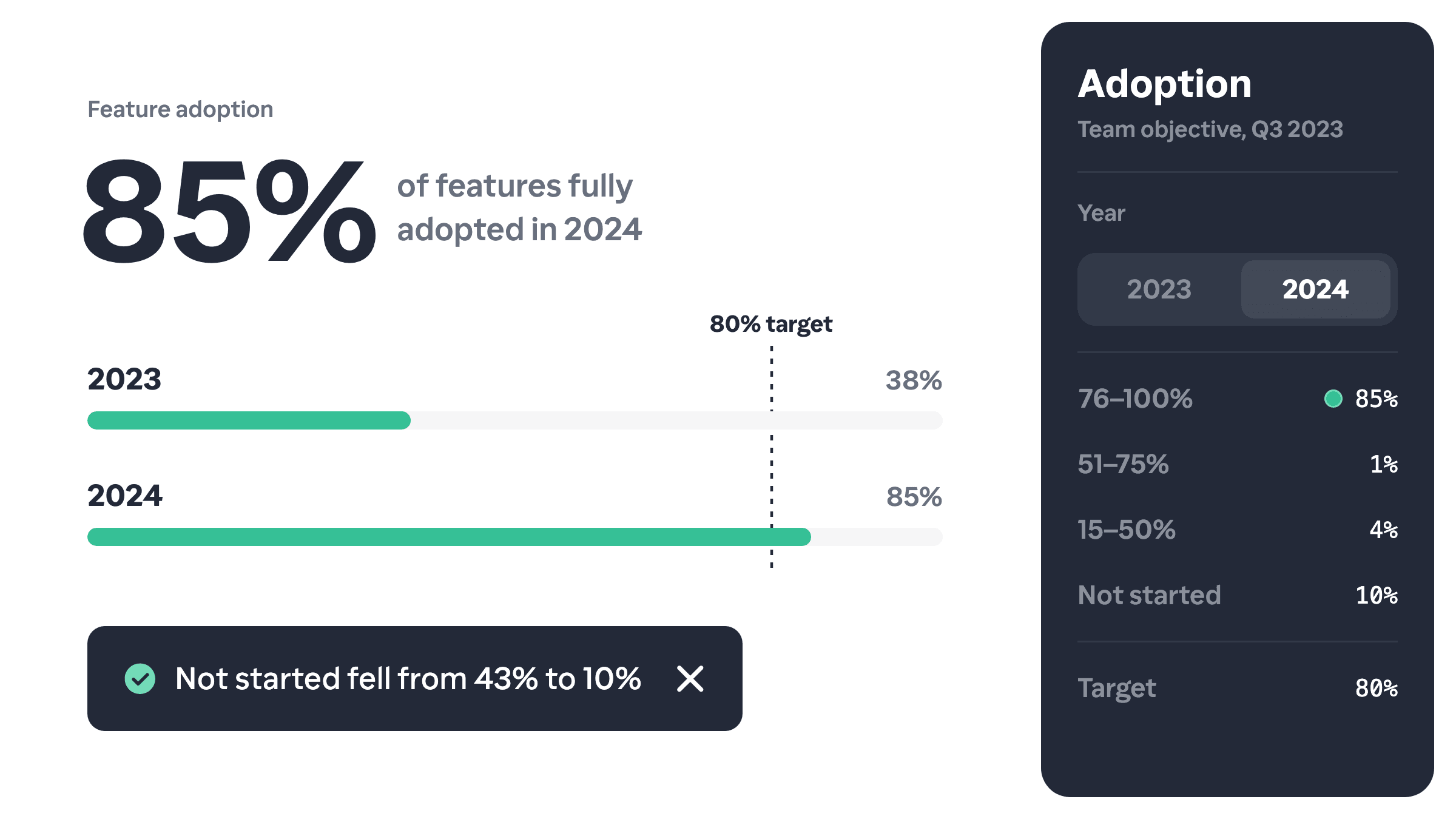
| Definition | Adoption rate across business units (BU), 2023 | Adoption rate across business units (BU), 2024 | |
|---|---|---|---|
| 76% to 100% | New designs and most legacy pages use the latest design tokens and components. | 37.8% | 84.6% |
| 51% to 75% | New designs and high-traffic legacy pages use the latest design tokens and components. | 1.3% | 1.2% |
| 15% to 50% | New designs use the latest design tokens and components. | 17.9% | 4.1% |
| Not started | The feature adopted only core components, or customised components away from the design standards. | 42.9% | 10.1% |
What does this mean?
Adopting the design system cut the time feature teams spend on UI debt. Once a team adopts it, the Mobile Platform team maintains the components, which frees the feature team for other work.
Enhancement of existing components
In 2023 we moved from building new components to refining existing ones, to reward the early adopters who backed the design system. Over the last few quarters we improved complex components such as Top App Bar and Bottom Sheet.
The design system team also built tools that cut feature teams' implementation time, such as the icon library, the date and time formatter and the currency formatter.
What does this mean?
Steady work on existing components gives adopters a design system that is stable and keeps improving. Feature engineers no longer keep features consistent by hand, so they can spend that time on other work.
Better documentation
A retrospective with designers and engineers showed that our documentation needed a new structure. Design and engineering documentation lived in separate places, so people struggled to find what they needed.
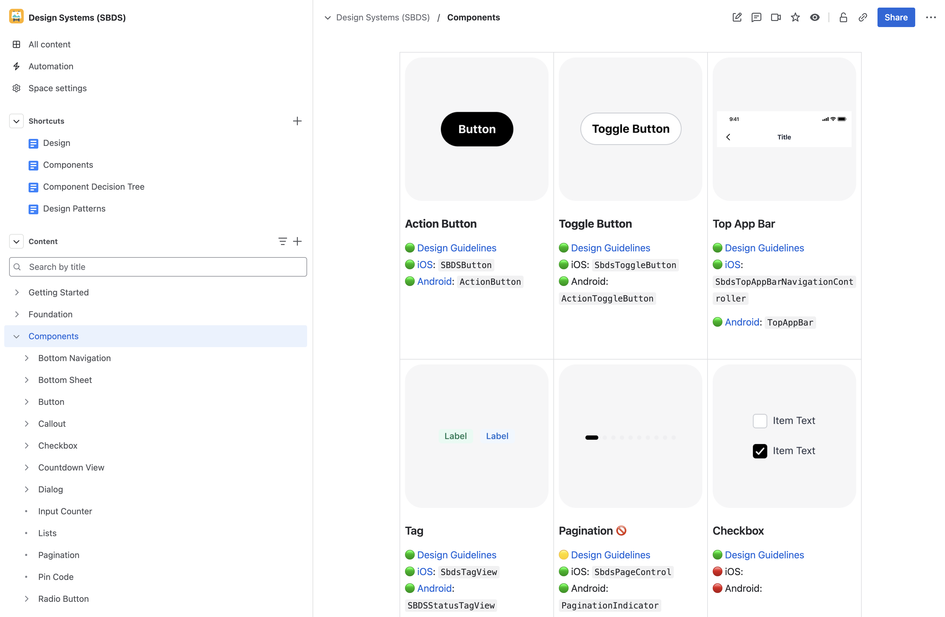
We moved all design system documentation into one Confluence space, Design Systems (SBDS), with one standard format for design and engineering documentation.
What does this mean?
One Confluence space now holds all design and technical documentation, and design system users find information in 25% less time.*
*We timed the same task before and after the documentation revamp.
Better feedback workflow
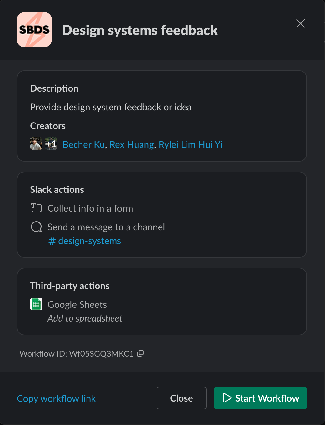
Feedback keeps the design system improving, so we set up a simple feedback workflow. Before, design and technical feedback had no single home, which caused miscommunication and wasted effort. Now all feedback goes to the #design-systems channel on Slack.
What does this mean?
The channel is the one place for design system feedback, and a form there takes thoughts, suggestions and issues.
Current state of SBDS
Focused on mobile
The design system stays focused on mobile. We will change that when web becomes a priority on the product roadmap again.
56 components and 17 design patterns
The engineering library holds 56 components, used more than 3,000 times. The design team also started writing patterns for common choices that teams find unclear, such as a dialog or a bottom sheet, and a bottom sheet or a full screen.
Maintaining 80% adoption
Keeping every feature at 80% adoption or more is still a core goal. Once a feature adopts the design system, it should stay on it.
Quality and standards
Every new component will ship with full documentation. We also aim to keep design system incidents reported through Dogfood to fewer than five a quarter.
In 2024 our System Usability Scale (SUS) score was 75.58, above the Good benchmark. In 2025 we aim to pass the Excellent threshold of 80.3.
What we plan next
The design system as a service
The design system is now the standard way we build products, not a temporary project. With adoption in place, the team will keep it in line with the company's strategy. We want the design system team to partner with feature teams, to raise product quality and plan ahead for what they will need.
SwiftUI and Jetpack Compose
Our component library does not yet support SwiftUI or Jetpack Compose, two mobile UI toolkits that more teams now use. The platform team is writing a plan to move to them.
Design standards
For designers, clear and consistent guidance matters most. We will keep removing ambiguity from the usage guidelines by writing principles for design decisions, so designs stay consistent over the long term.
The 80:20 rule
We do not aim for 100% adoption. Some features have needs that call for something outside the design system. The team will watch this "unique 20%", and add an element to the library once several features use it.
2023 year in view
A year of pitching the design system and building support across the organisation.
Rebranding with new colours, icons and illustrations
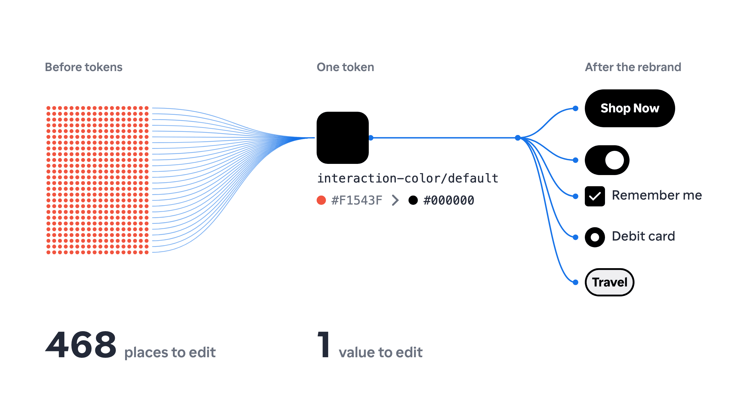
During the rebrand we used design tokens to change our primary colour from orange to black across the app. We also refactored the codebase and remapped 468 colour nodes. To match the new brand, the team redrew the icons and illustrations.
What does this mean?
If we ever need to change our brand colour from black to blue, we need to change only one value.
Font standardisation for iOS and Android
Native system fonts kept our font styles from scaling. We redefined the font styles with clear standards and built a font component so they scale from now on.
Only 15%* of our components use the new font styles so far, but the standard already helps, starting with the content platform (CP) components that adopted it in Q4 2022.
*The figure includes all legacy code. The data comes from a filter on sbdslabel and sbdstextview.
What does this mean?
As with colour, we can now swap values in one place, and the font component lets us update fonts across the app.
Component previews in the app
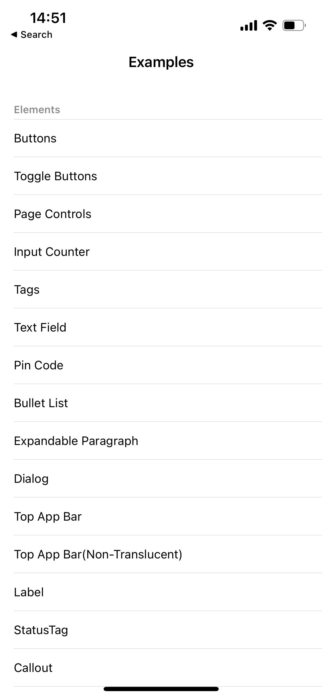
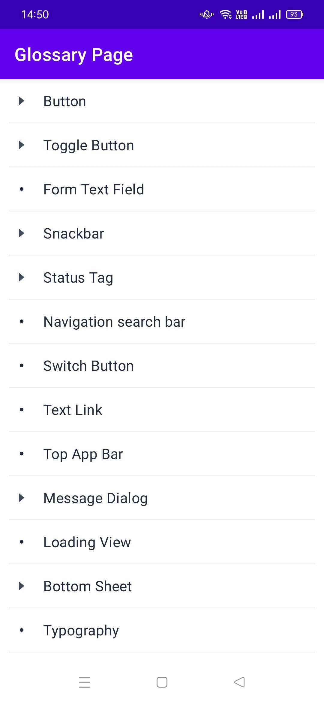
In 2022 the whole company started testing the app internally through the Dogfood app. We added design system component previews to it, and every designer must now install it.
What does this mean?
Adopters can see at a glance which components the engineering library has. Designers can also test how a component looks in the live app.
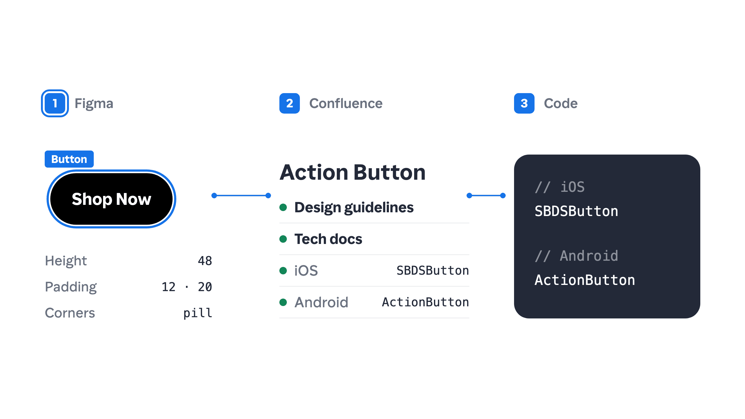
A handover process from Figma to Confluence to code
Adoption should start at the design stage. We now have processes and documentation for handing designs over to engineering, and we encourage engineers to use design system components wherever they can.
By having the design system UI checker both as an app and a figma component, I am able to know if a component is built in the design system. Previously, I had to keep clarifying with the design systems lead and various engineers if we have any reusable components to use in a project. By having these checkers, it has helped us to reduce effort in re-designing and rebuilding existing components, and be more consistent throughout our designs in our app today
- Anonymous Product Designer
What does this mean?
The handover workflow carries the design system from Figma to code. Figma shows which tokens and components a design uses, with links to the technical documentation.
Better quality for new components
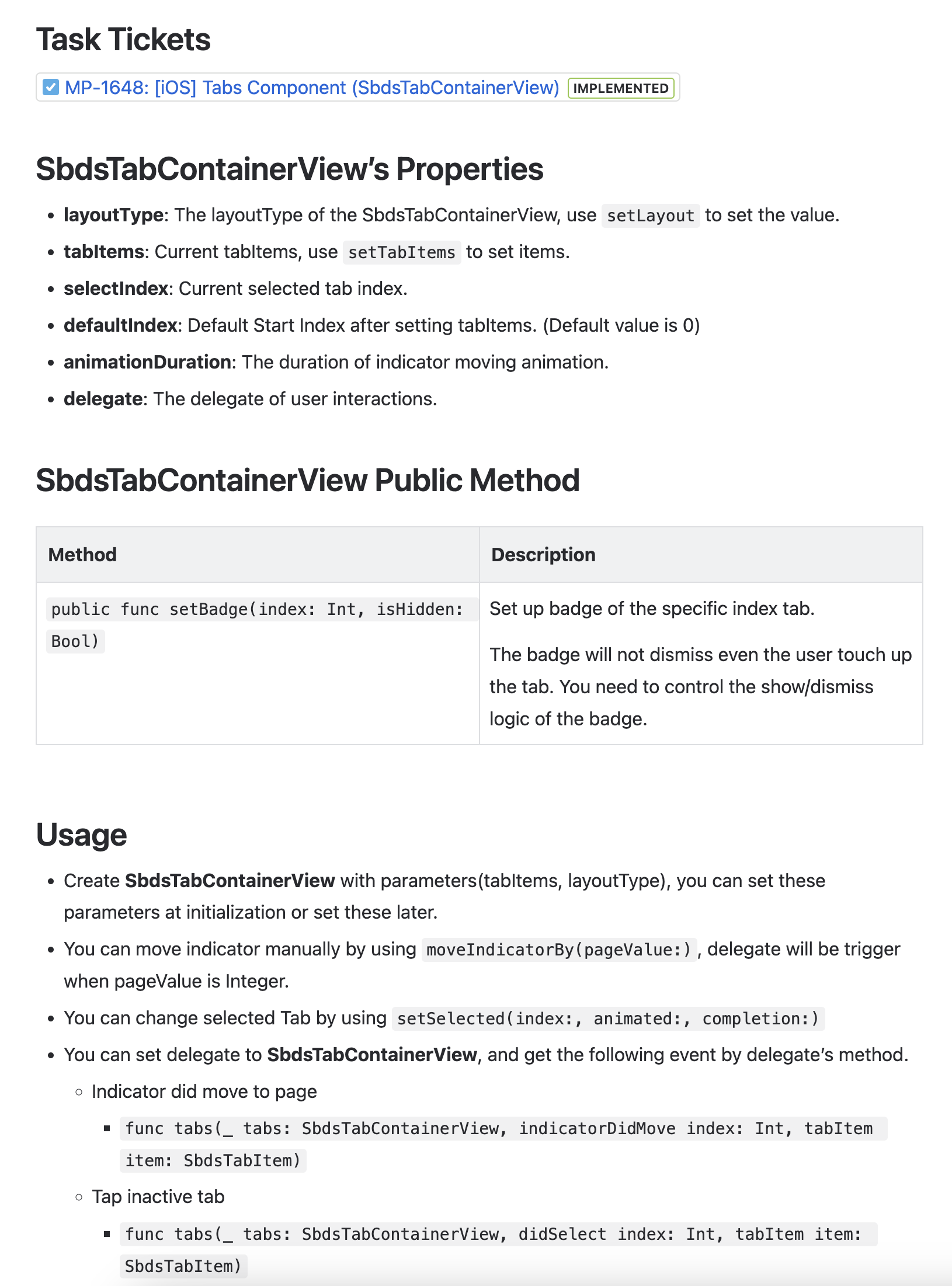
With a focus on scalable design, the team has delivered better components with clearer guidelines and component APIs. Last year, we shipped seven new components (Top App Bar, Bottom Sheet, Dialog, Snackbar, Tag, Callout and Tabs) with guidelines and technical documentation.
Using design system component can cut down my effort by 50%. I don’t need to worry about interaction details and frontend logic.
- Anonymous Mobile Engineer
The app typography is much clearer to me today. Previously, I had a lot of confusion regarding when to use certain types of typography. However, with the new guidelines, I have a clearer idea of when to apply certain font styles.
e.g. I know metrics are specifically use for numbers when I am working on my design.
- Anonymous Product Designer
What does this mean?
Before, we had no clear process or standard for designing components, and contributions often served a single use case. Now every new component ships with usage guidelines, clear UI specifications and technical documentation.
Measuring adoption rate with design system dashboard
A few quarters ago we could not measure adoption. Now our dashboard gives us a baseline, so we can plan and predict our next steps.
As of today, this is the adoption rate of design system components across different features.
| Definition | Adoption rate across BU | |
|---|---|---|
| 76% to 100% | New designs and most legacy pages use the latest design tokens and components. | 37.8% |
| 51% to 75% | New designs and high-traffic legacy pages use the latest design tokens and components. | 1.3% |
| 15% to 50% | New designs use the latest design tokens and components. | 17.9% |
| Not started | The feature adopted only core components, or customised components away from the design standards. | 42.9% |
What does this mean?
Today, we are able to get a rough idea of which features have adopted design system components and plan what needs to happen.
Current state of SBDS
Mobile-only
So far the design effort has focused only on the mobile app, and we have neglected web components. The feature gap between mobile and web shows it.
One quarter build, one quarter adopt
Over the past few quarters, we have taken the approach of prioritising frequently used components. We ship components one quarter ahead so the feature teams have time to plan for adoption. Even so, many feature teams have pushed back on the extra effort adoption takes.
22 components available in mobile engineering library
The mobile engineering library has 22 components, so every page uses at least two design system components.
Teams have used the Tag component, which we overhauled, 72 times on iOS and 85 times on Android since its release. A tag takes about a day to build from scratch, so reuse has saved about 114.5 days of effort.
Documentation as part of the process
We doubled down on component documentation as the team grew. In 2022 we wrote 10 component documents, up from close to none in 2021, which improved the design team's foundation and component guidelines.
About 50%* adoption across business units
Adoption averages about 50% across business units (BU). The content platform team has the highest, close to 100%, because the app uses content platform components in many places.
Why adopt SBDS?
Reduce effort to implement design
Design system components cut front-end effort by 50%, so teams can focus on front-end logic and harder problems. Components from the library also need no extra QA.
Get API updates automatically
Dedicated teams govern and maintain the components, and review and update them as the product needs. Design system components let us change designs at scale. When we add a new API to a component, every adopter gets it automatically.
Reduce UI redundancy at scale
With design system components, changing the primary colour or base font size is easy. When we update a component, a rebrand or UI overhaul needs no work from your team, which means less refactoring.
What are we doing next for Q2’23?
Stronger adoption starting with new pages
We know teams have other priorities and limited resources. Next quarter we will keep supporting adoption, and we encourage every team to use the design system on all new pages. Thank you to the teams that have already tried it.
Enhancement of existing components
To reward our adopters, we will focus more on improving existing components, including their interactions and architecture, so they better fit adopters' needs.
Better documentation
Many components still lack design guidelines, which leads to inconsistent design decisions. As we build fewer new components, we will use the time to write full documentation for the wider team.
Build a feedback loop for component improvements
We also want adopters to give us regular feedback, such as proposals or updates to guidelines and standards, so we can keep refining the design system.